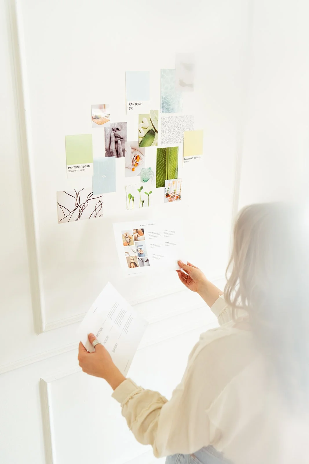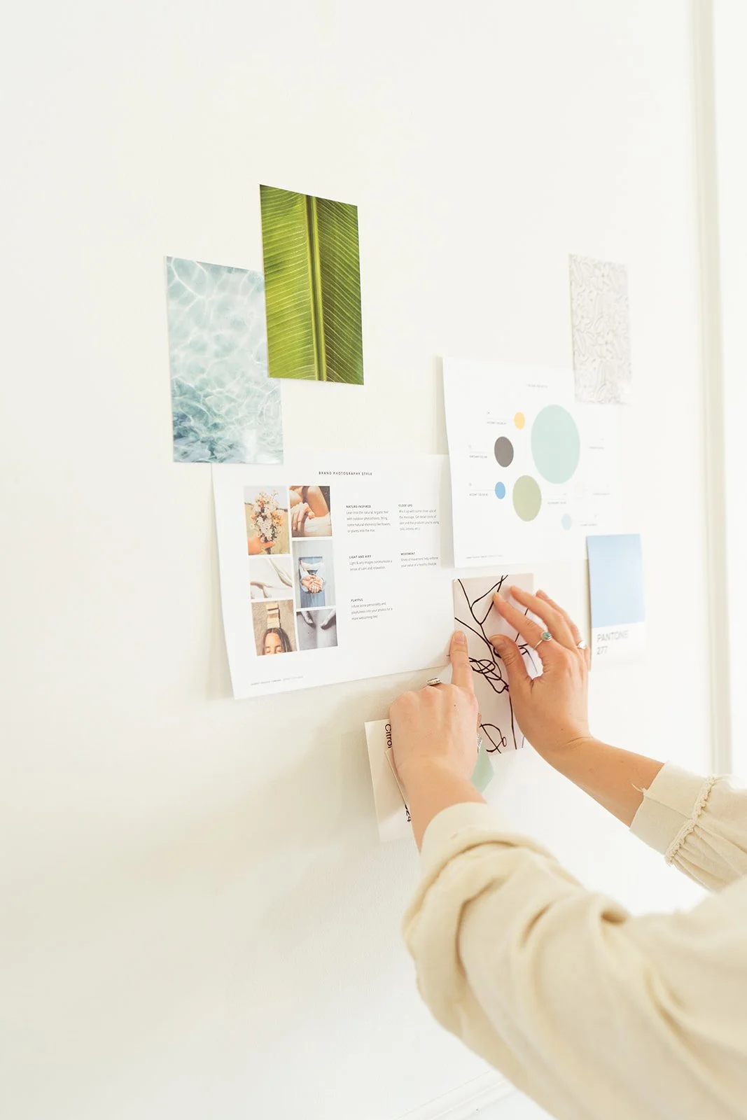
Creating a Pinterest board for your brand should be one of the fun parts of the process. It is a chance to follow your instincts and collect the colors, typography, photography, textures, places, and details that catch your attention.
It can also get overwhelming quickly. You may find yourself drawn to several completely different styles and wonder how they are supposed to fit together. The good news is that you do not need to have that part figured out.
Your inspiration board is not meant to be a polished or perfectly cohesive representation of your future brand. Think of it as a collection of visual clues that helps your designer understand what you are drawn to, how you want your brand to feel, and where the creative direction could begin.
The goal of this guide is to help you gather those ideas with enough intention to be useful, without overthinking every pin.
Inspiration board vs. brand moodboard: What is the difference?
Although the terms are sometimes used interchangeably, an inspiration board and a moodboard serve different purposes within the branding process.
A brand inspiration board is the collection you create. It can be personal, exploratory, and a little unfiltered. It shows what catches your attention and offers an early look at the visual world you imagine for your brand.
A brand moodboard or stylescape is the more focused direction your designer develops after considering your inspiration alongside your goals, audience, positioning, and strategy. It brings those pieces together into a cohesive visual direction that can guide the identity.
You are not expected to design the brand before the process begins. Your job is to share the clues. Your designer’s job is to find the connections and shape them into a direction that makes sense for your business.
Examples:
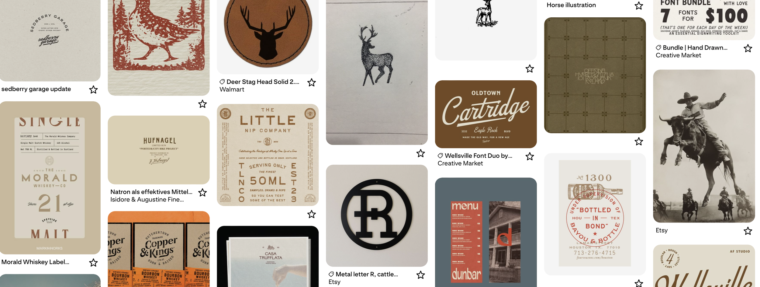
Pinterest Inspiration Board
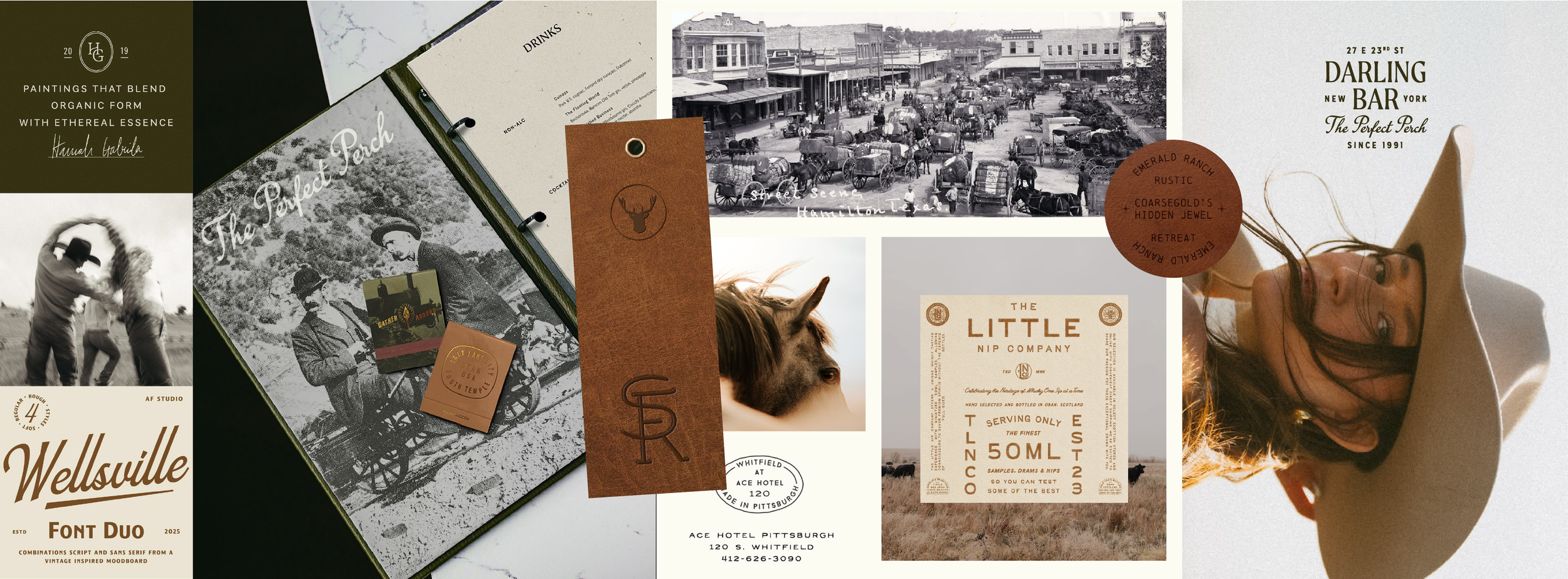
Brand Stylescape
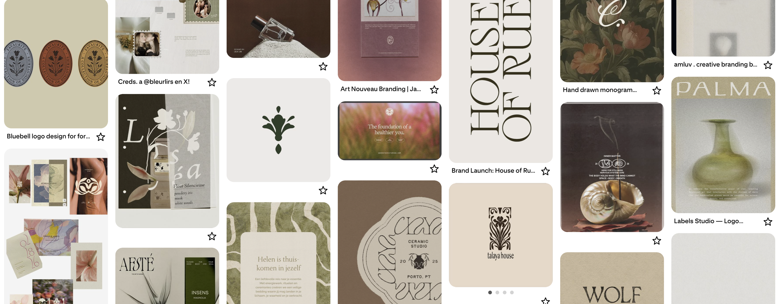
Pinterest Inspiration Board
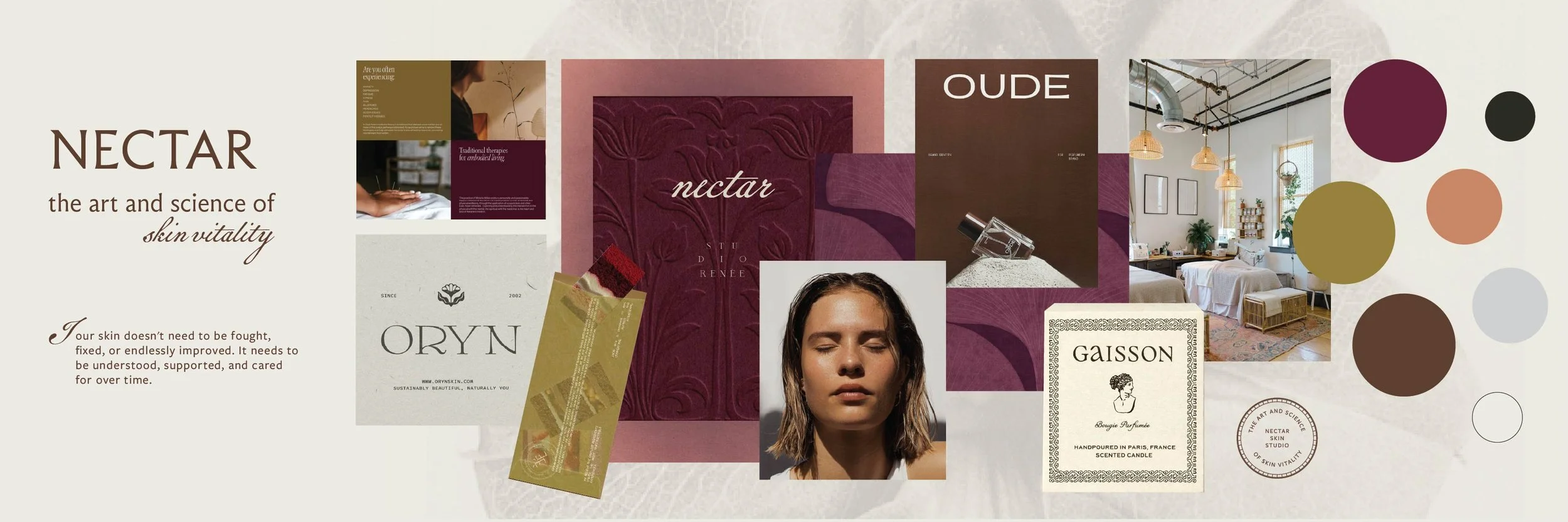
Brand Stylescape
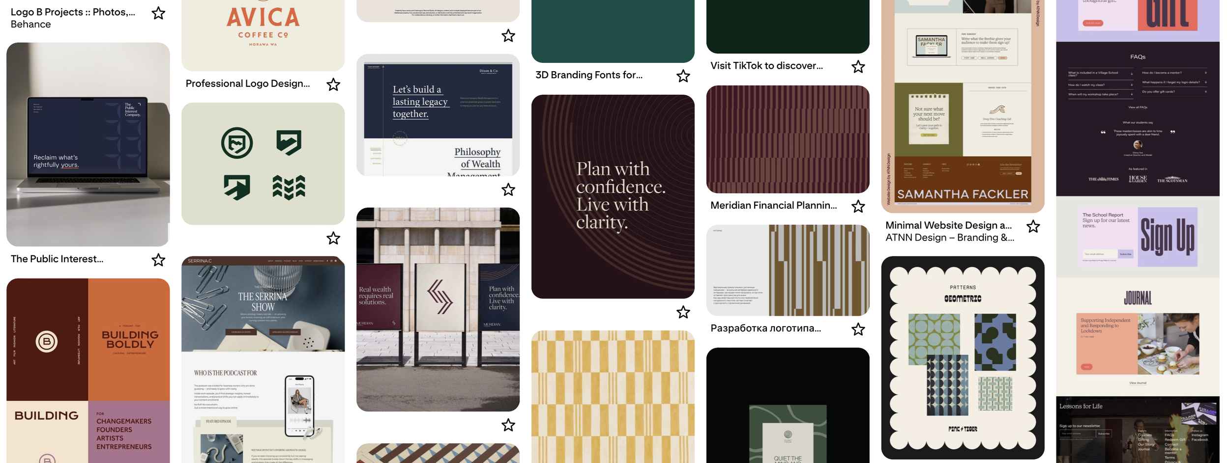
Pinterest Inspiration Board
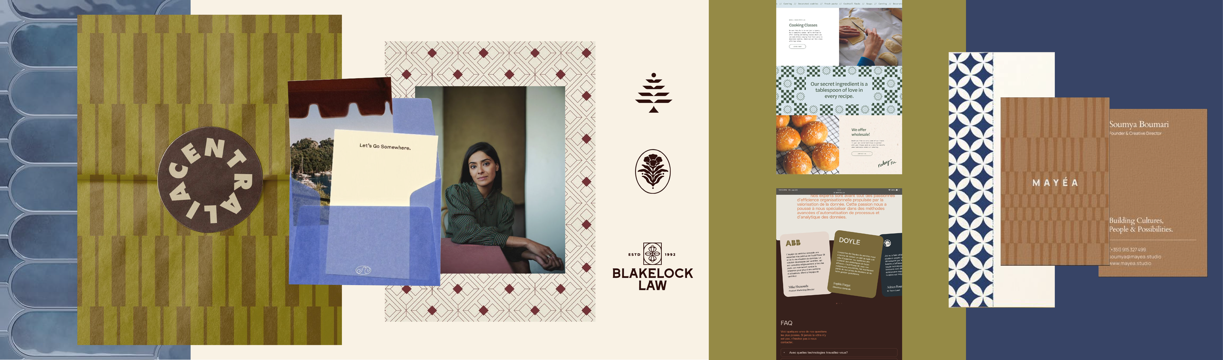
Brand Stylescape
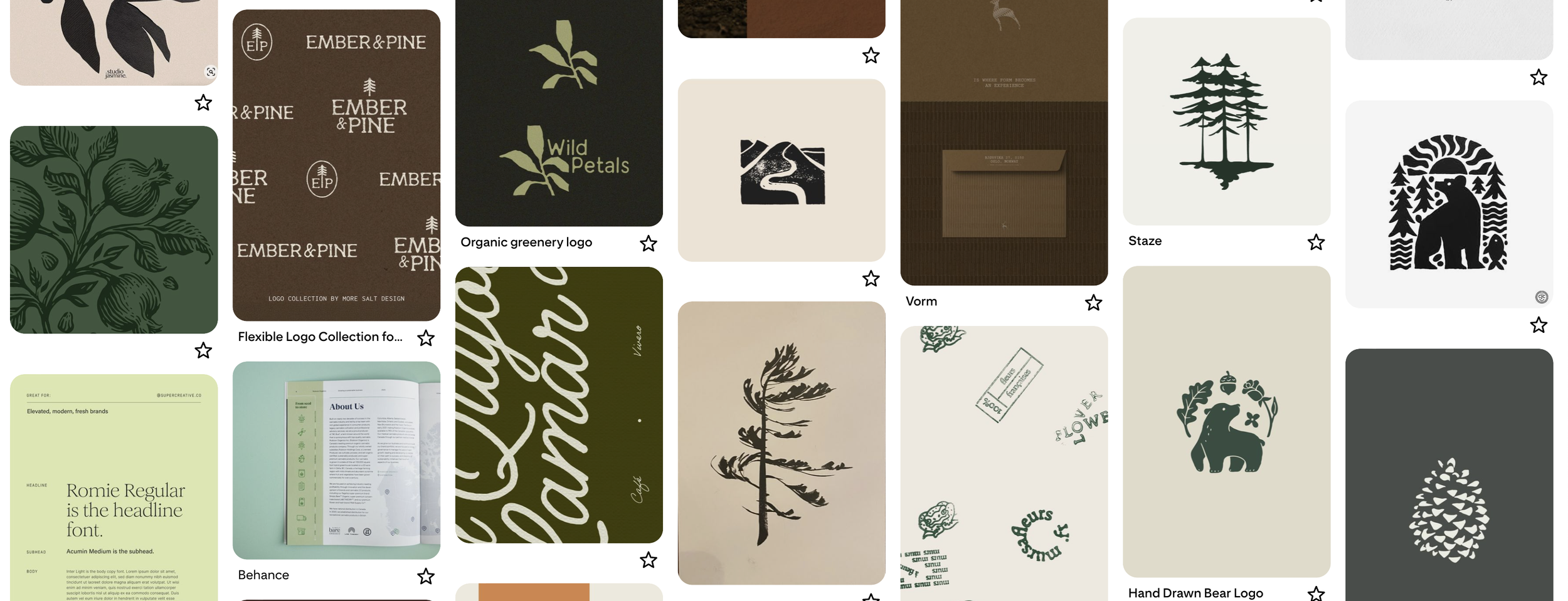
Pinterest Inspiration Board
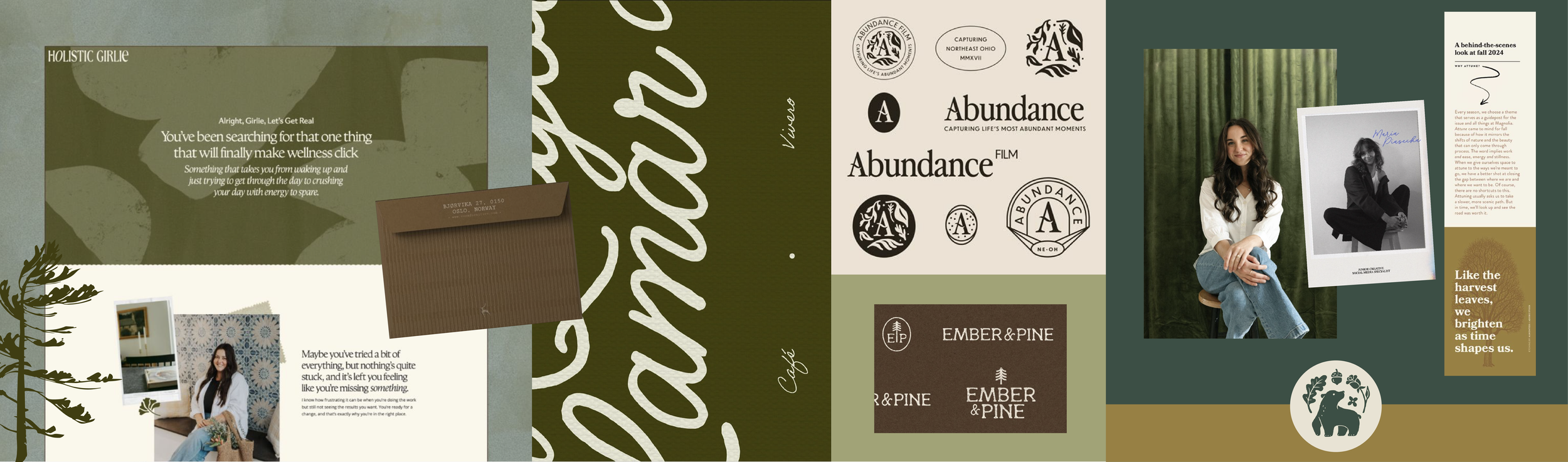
Brand Stylescape
Before you start pinning
Take a few minutes to think about how you want your brand to feel. Choose three to five words to keep in mind while you search.
For example:
Warm, refined, storied, inviting
Bold, capable, outdoorsy, energetic
Playful, expressive, unexpected, welcoming
Minimal, natural, tactile, thoughtful
Nostalgic, spirited, polished, distinctly Western
These words are not rules. They are anchors. If you start falling down a Pinterest rabbit hole, they can help bring you back to the experience you want your brand to create.
Try to move beyond broad words like professional, high-quality, or unique. Most businesses want to be those things. A more specific combination gives your designer much more to work with.
What should you add to your brand inspiration board?
There is no required checklist, and you do not need an equal number of every type of image. Save what genuinely catches your attention.
Your board might include:
Photography styles
Color combinations
Typography and lettering
Packaging
Editorial or magazine layouts
Signs and environmental graphics
Architecture and interiors
Landscapes and natural elements
Clothing and styling
Materials and textures
Illustrations, icons, or patterns
Printed pieces such as menus, postcards, or book covers
Objects that feel like they belong in your brand's world
Historical or cultural references that are relevant to your story
The most useful inspiration often comes from outside your industry. If you own a skincare studio, your board does not need to be filled with skincare logos. A ceramic glaze, interiors, vintage illustrations, fabric texture, or beautifully composed photograph may communicate the feeling you want much more clearly.
Looking beyond direct competitors also gives your designer more room to create something original rather than producing another version of what already exists in your space.
Pin what you are drawn to, not what you think you should choose
You do not need to know whether an image is strategically correct before you save it. If something catches your attention, add it.
At this stage, instinct is useful. You may begin noticing patterns you would not have been able to name ahead of time. Maybe you consistently choose deep, earthy colors. Maybe everything feels editorial and spacious. Maybe you are drawn to hand-drawn details, imperfect textures, or an unexpected pop of red.
Those patterns give your designer something meaningful to interpret.
At the same time, try not to pin images simply because they are trendy or beautiful. Ask yourself whether you would still be drawn to the image if you had not already seen the style everywhere.
Tell your designer why you saved it
This is one of the most helpful things you can do.
Two people can look at the same image and notice completely different things. You may save a restaurant menu because you love the typography, while your designer assumes you like its red-and-pink color palette. A short note removes the guesswork.
You do not need to comment on every pin. Add a sentence to the references that feel especially important or representative.
For example:
“I like how warm this feels without becoming rustic.”
“The type feels editorial but still approachable.”
“I love the energy and movement in this photography.”
“This color combination feels unexpected in a good way.”
“I am drawn to the imperfect, hand-done quality.”
“I like the overall feeling, but not the actual colors.”
“This is more minimal than I want, but I love the spacing.”
It is completely fine to like only one part of an image. Your note helps separate the useful clue from everything else in the reference.
Do not limit yourself to logos
It is natural to search for logo inspiration when you are preparing for a brand project, but a board made entirely of logos can create a few problems.
First, it shows only one piece of a much larger identity. Your designer also needs to understand the photography, atmosphere, textures, color, styling, and emotional quality surrounding the brand.
Second, saving too many finished logos can unintentionally narrow the process to recreating a style that already exists. Your designer may reference what you like about them, but the goal is to build an original identity around your business.
Include logos if they help communicate a preference, but balance them with images that show the broader world of the brand.
How many images should you save?
There is no perfect number. A board with 20 thoughtful references can be more helpful than one with 200 loosely related pins.
As a general guide, aim for around 25 to 50 images. That is usually enough to reveal patterns without making the board difficult to interpret.
If you enjoy the process and end up with more, that is okay. Take one final pass and remove obvious duplicates or images that no longer feel relevant. You do not need to make everything match. Just clear out anything that sends the board in a direction you know you do not want.
What if your board feels inconsistent?
Do not panic. Some inconsistency is expected, especially when you are still exploring.
You might be drawn to two directions that seem at odds, such as refined and playful, modern and nostalgic, or minimal and expressive. Those contrasts can become part of what makes a brand interesting.
Your designer's job is to determine whether those ideas can work together, which direction should lead, and how the balance connects to your audience and goals.
If you notice a major split in your board, you can create two sections or simply leave a note explaining what you see. You do not need to choose a winner before sharing it.
Common mistakes to avoid
Trying to make the board perfect
This is an inspiration-gathering exercise, not a design test. Your board does not need to look presentation-ready.
Pinning only what is popular
Trends can be useful references, but they should not replace your own perspective. Look for images that feel connected to the business rather than what happens to be everywhere right now.
Staying entirely within your industry
Pulling from a broader visual world creates more possibilities and helps your brand avoid blending in with its competitors.
Choosing only what matches your personal style
Your taste matters, especially when you are closely tied to the brand. But the final direction also needs to support the business, connect with the right audience, and reflect the experience you want to offer.
Assuming your designer knows what you mean
When an image really matters, say why. A short note can prevent an entire visual direction from being misunderstood.
Expecting the final brand to copy the board
Your inspiration will inform the identity, but the final logo, colors, typography, and supporting elements should not be direct copies of what you pinned. The goal is to translate the overall feeling into something original and specific to your business.
A quick check before you share your board
Before sending your Pinterest board to your designer, ask yourself:
Did I include more than logos and examples from my own industry?
Does the board give a sense of how I want the brand to feel?
Have I added notes to the images that matter most?
Did I explain any references that show what I do not want?
Are there obvious duplicates or unrelated pins I can remove?
Have I left room for my designer to interpret and build on these ideas?
If so, you are ready to share it.
Your job is to provide clues, not all the answers
The most helpful inspiration board is not necessarily the most beautiful or perfectly coordinated one. It is the one that gives your designer an honest look at what draws you in.
Collect what feels meaningful. Explain what you notice. Then give the creative process room to uncover the connections you may not see yet.
Your inspiration provides the clues. The strategy and design turn them into a brand with a clear point of view.
Ready to turn your ideas into a brand that feels clear, cohesive, and completely your own? Let's map out your next move.